My friend asked me if I could add some spice to her photos, and here they are:
Original Picture

Removed Blemishes

After Some Extra Spice & Everything Nice

Another original photo:

This is Abz after some Scotch, Brandy and other hard boozes:


 After Photoshop
 Original
 Added a pic of her with normal skin tone with blue hair and lips, and purple eyes.
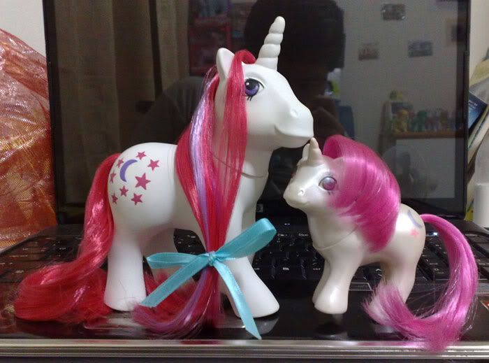
 There's a reason why I love digital painting! I get to colour all the things I love! This assignment involves colouring a character I like. Being a die-hard pony collector, a pony seems like a natural choice. After browsing on the web for ages looking for the perfect outline, I gave up and took up an outline of Whizzer the Pegasus Pony. I think she looks the best by far. I'm extremely pleased with how her hair turned out, albeit maybe a tad too shiny, but I LOVE SHINY! I don't think she was originally that shiny. I forgot what I did and the the light and contrast went a little beserk, and there was too many layers to trudge through to correct the mistake. The different is slight anyway - between SHINY or not so shiny. This outline is probably used to death in many My Little Pony comics, merch and storybook illustrations, but the colouring are always flat, so I took the real toy of her as a reference and tried to give this attempt some sense of volume, yet I didn't want to make her too realistic. I wanted to imitate how the old generation 1 ponies were presented on their packaging. It was a fusion between semi-realistic and pastel 2D water colour-eque drawings, and I really wished I could draw and colour like how they were done on the packaging! It was actually what really got me into collecting, I simply LOVED how they were drawn - that particular style. I gave the pony's body a slight shine to give it a plasticky vinyl quality. The only part I am not too pleased is Whizzer's eyes. They're supposed to be jewels, but I don't think they look shiny enough. The background is completely done by me. It's not hard to make a blue backdrop and painting a rainbow and smudge some clouds on, but I still like to take credits for it. lol There's nothing wrong about being shameless.


 Click on picture for larger version